Check-in
Issues
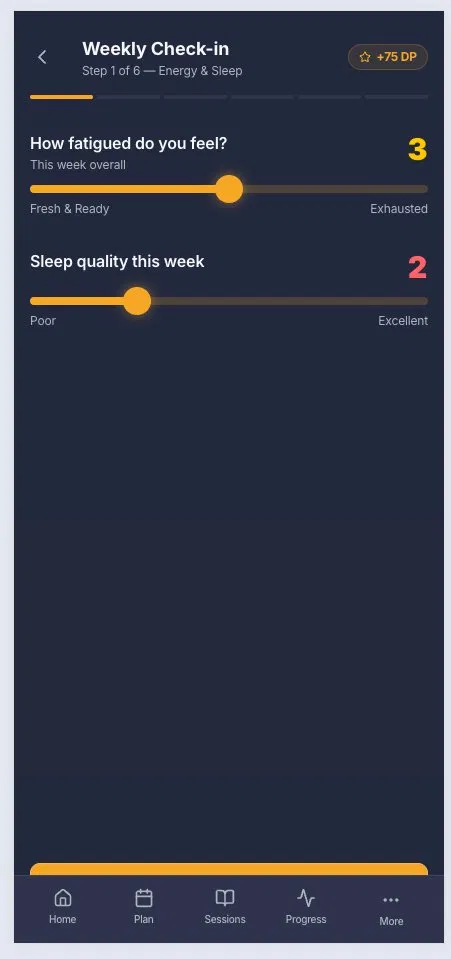
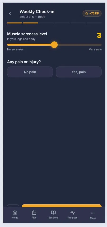
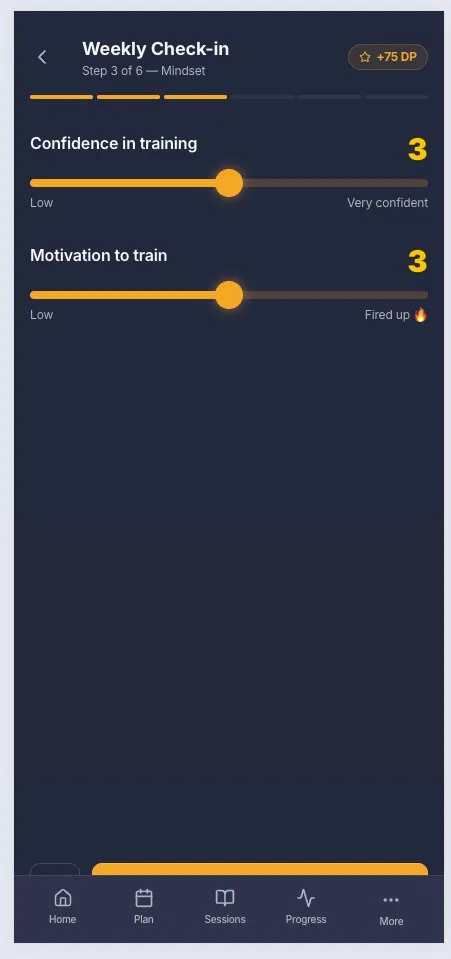
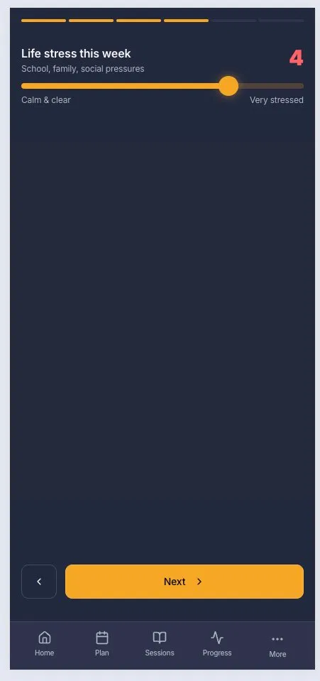
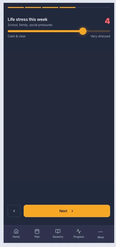
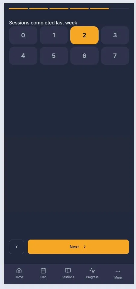
- Massive empty space on every screen. Steps 1–5 each have a question or two at the top and then 60–70% dead screen below. Nothing fills that space — no illustration, no context, no plan rationale, no reinforcement. This is the worst problem. A 16-year-old is staring at dark navy nothing while being asked to rate their fatigue. There's no reason that input should feel clinical.
- The bottom nav should not be visible during check-in. Showing Home/Plan/Sessions/Progress/More while the user is mid-flow is an escape hatch that breaks the commitment framing. Train Effective removes nav during onboarding for exactly this reason. Check-in is a focused task — treat it like one.
- Score color inconsistency on step 1. Fatigue value "3" is yellow/orange. Sleep quality value "2" is red/pink. On step 4 (stress), "4" is also red. The color change implies a severity system but it's never explained and it's not consistent across screens.
- Step 4 loses the header chrome entirely. Steps 1–3 show "Weekly Check-in" title and "+75 DP" badge in the nav area. Step 4 is cropped and that header is gone
- "Sessions completed last week" (step 5) is a manual input for data the app already has. The app tracks sessions. Asking the user to self-report last week's count is either a data integrity problem or a missed opportunity to pre-fill and confirm
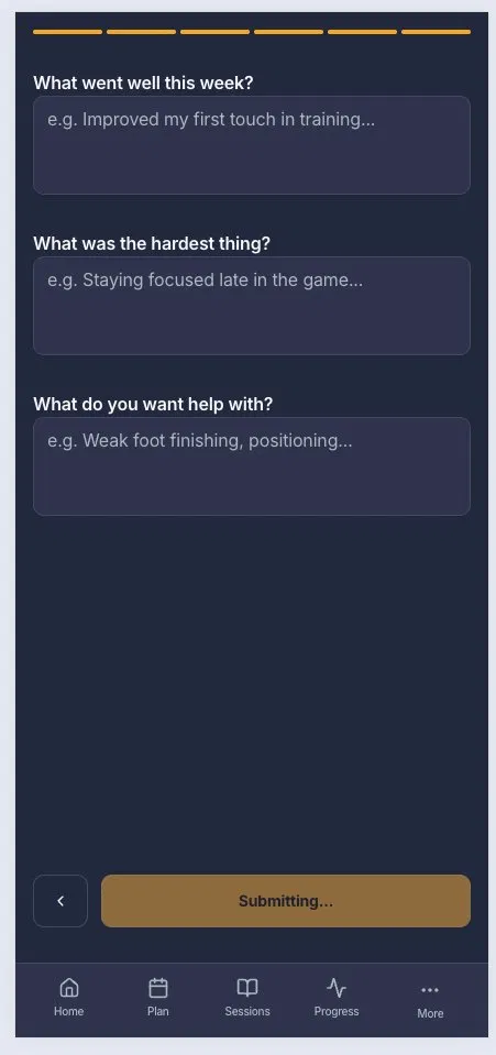
- Step 6 — three open text fields is too much friction at the end. "What went well / Hardest thing / What do you want help with" are three separate cognitive tasks stacked after five slider/selector steps. This is the point where users abandon. At minimum, make all three optional and say so. Better: make "What do you want help with?" the only required field since it's the one that actually informs the plan.
- "Submitting..." button state on step 6 is shown in a muted gold/brown. That's not a loading state color — it reads as disabled. Either use a spinner overlay or maintain the orange with a loading indicator. Brown communicates broken.
What's working:
- Step structure (6 labeled steps, segmented progress bar) is solid
- Slider mechanic is clean and appropriate for subjective ratings
- Copy on the sliders ("Fresh & Ready → Exhausted", "Fired up 🔥") has personality — keep it
- The +75 DP incentive in the header is the right idea, earning points for check-in is good motivation
- Step 2's binary "No pain / Yes, pain" toggle is the right input type for that question
Changes https://apply-fir-47063405.figma.site/check-in https://apply-fir-47063405.figma.site/check-in/step-2 https://apply-fir-47063405.figma.site/check-in/step-4 https://apply-fir-47063405.figma.site/check-in/step-5