Home
- Know your user. Design for who is actually using the screen, not who you imagine is using it. Every decision flows from this.
- One screen, one job. Every screen should have a single primary action. If you can't state what the screen is for in one sentence, it has too many jobs.
- Don't make the user think. If something needs explaining, it's already broken. Labels, icons, and flows should be self-evident.
- Hierarchy drives attention. The most important thing on screen should be the most visually dominant. If everything is important, nothing is.
- Reduce friction at every step. Every extra tap, every redundant field, every unexplained state is a place where a user stops. The best UX is the one the user doesn't notice.
PAGE PURPOSE - has a clear Start today's session but stacks four secondary jobs under it (motivate / navigate / nudge / monetize). (from replit) - The home screen is a personalized mini dashboard that shows the player their status at a glance, surfaces today's primary action, and confirms the app knows who they are — so a player, parent, or coach can read the screen in seconds without tapping anywhere.
Screenshots
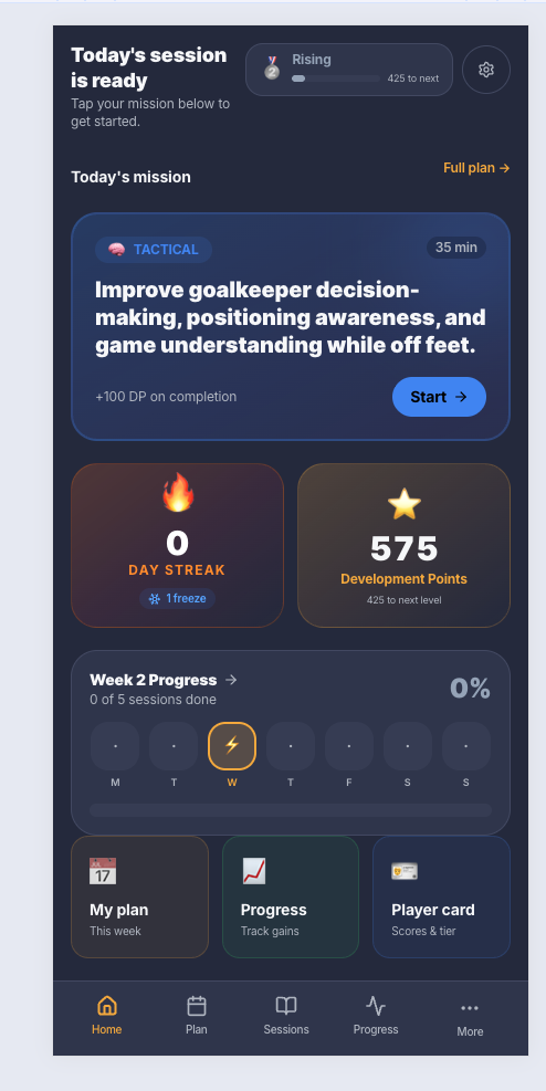
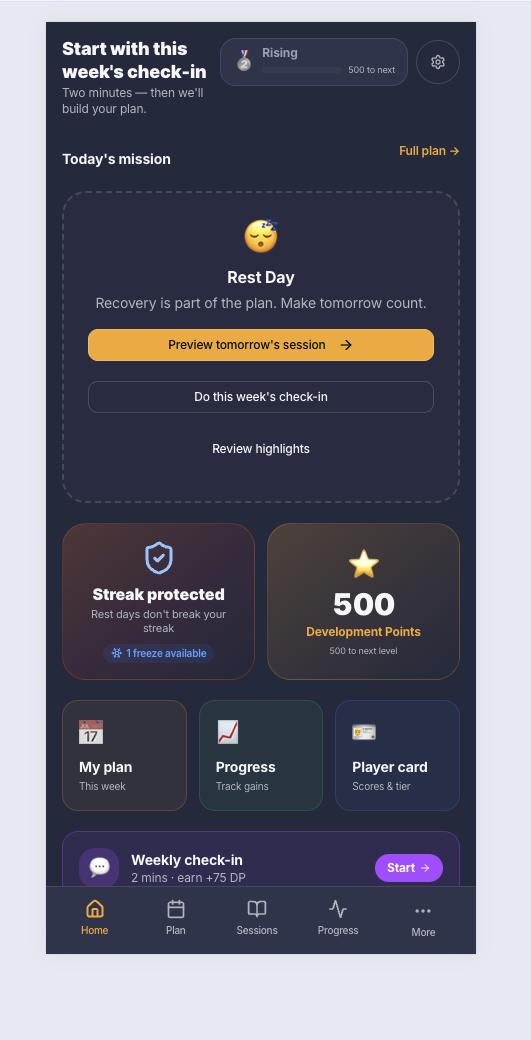
Changes: https://apply-fir-47063405.figma.site/ note there are 2 versions, set via the settings page in home page
Hero replaces text header** The app had no visual identity. Both benchmarks open with a full-width athlete image. A sport app must feel like the sport before the user reads a word.
Check-in consolidated to one card** The same action appeared twice on one screen. One trigger, one card.
"Rest Day" heading removed from mission card** The hero already says "Recovery in progress." Two labels for the same state on the same screen is redundant.
"ACTIVE RECOVERY MODE" sub-card removed** A card inside a card adds visual noise without adding information the user needs at this moment.
Session count removed from streak card** It already appears in the mission card progress bar. Showing the same number twice on one screen is clutter.
Context strip above nav removed** Position and level are already in the hero badge. The strip repeated it a third time.
CTA buttons changed to pill shape** Buttons and cards shared the same border radius making interactive elements indistinguishable from containers. Pills create a clear visual grammar: rounded rectangle means card, pill means tap me.
3 Card section does not contribute to primary