Plan
Page Purpose
- If the home screen owns "what do I do today," then Plan owns "why is my week built this way and what does the full picture look like."
- Plan is the strategic view — pillar breakdown, weekly load, progression rationale, and the full session list by day. It answers questions the home screen doesn't: what am I working on technically this week, how does today fit into the larger program, what comes next.
- Which means:**
- Plan should not have a primary CTA of "Start today's session" — that belongs on Home Plan's primary action is "understand and navigate my program" - Any element on Plan that duplicates the Home dashboard — streak, DP, today's mission — is in the wrong place
- One liner: Plan is the coach's clipboard — the full picture behind today's single task
Screenshots
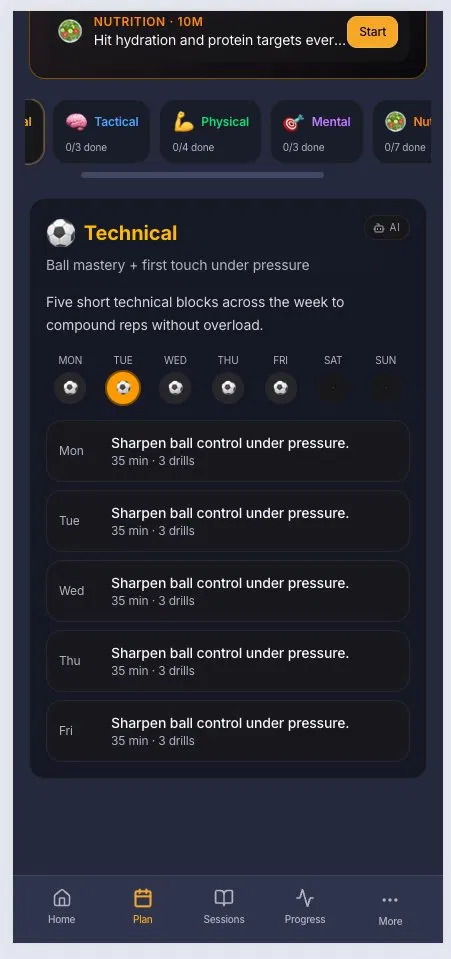
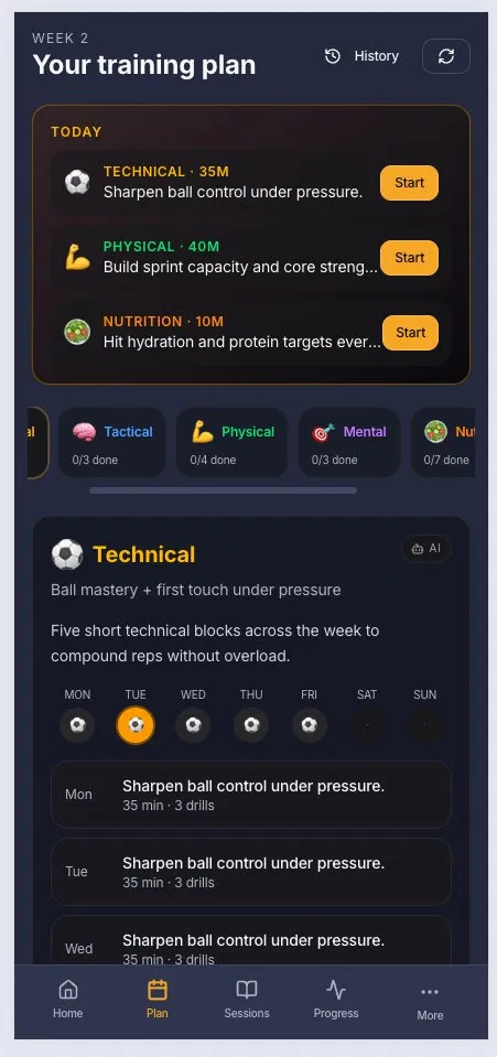
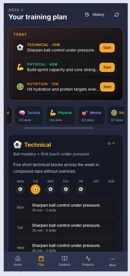
****
Structure Changes
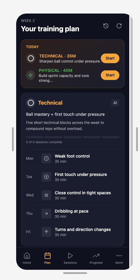
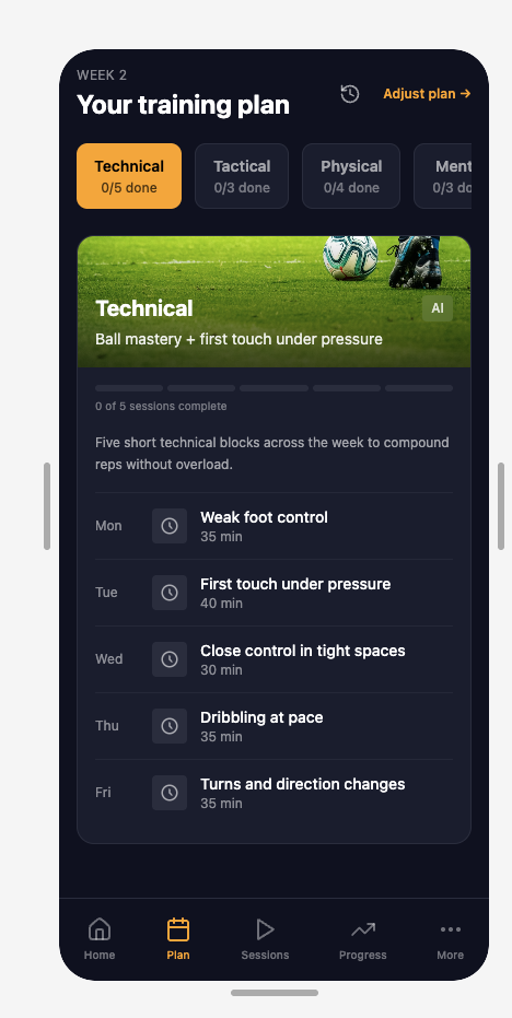
https://apply-fir-47063405.figma.site/plan NOTE: v1 and v2 screens set via settings panel in home screen
- TODAY card removed from Plan — home screen owns "what do I do today," Plan owns strategy
- Horizontal category scroll strip removed — duplicated TODAY card information
- Pillar tabs (Technical/Tactical/Physical/Mental/Nutrition/Psychology) with done/total counts replace both — single navigation mechanism, no redundancy
Header Changes
- "Adjust plan →" replaces ambiguous refresh icon — exposes the controls users need to modify their plan (sessions, position, focus, intensity) [consider adding this]
- History icon retained with label — plan history is a legitimate Plan page function
Pillar card Changes
- PLACEHOLDER photo header added — matches Techne's visual standard, differentiates pillar cards from plain data cards
- Day-of-week icon row replaced with segmented progress bar — eliminates redundancy with session list below, adds completion status the list didn't provide
- Distinct daily session descriptions replace identical copy — gives users a reason to return each day
- Consistent clock icon replaces inconsistent mixed icons — removes decorative elements with no clear meaning
- Varied durations per session replace identical "35 min" — accurate metadata
What didn't change
- Plan rationale text — was correct from the start, kept throughout
- AI badge on pillar card — legitimate signal, retained
Issues not fixed
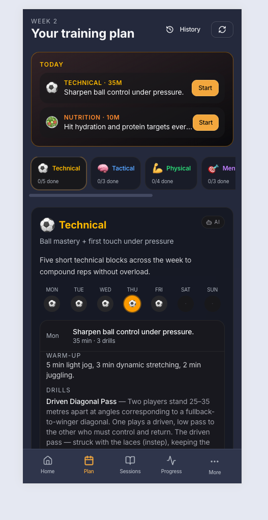
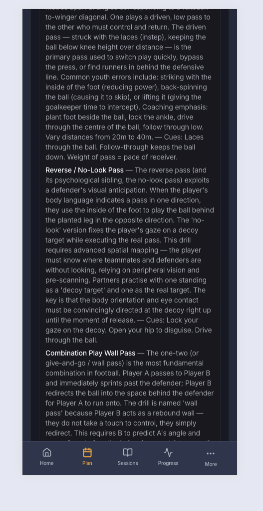
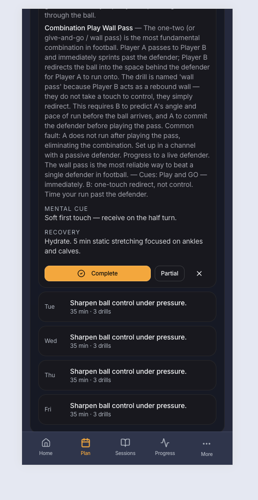
Overlap in content: 1. Plan page — inline expand → preview + one-tap Complete/Partial/Skip 2. Session page (/sessions/:id) — the full walkthrough experience
That's a genuine redundancy, and a slightly confusing one: a player could "complete" a session from the Plan page without ever doing the actual walkthrough. If you want, the cleaner model would be for the Plan day to either (a) just preview and then push you into the real session screen to do/log it, or (b) stay as a lightweight quick-log and drop the duplicate walkthrough — but not both competing.